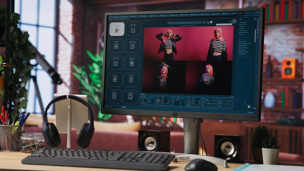
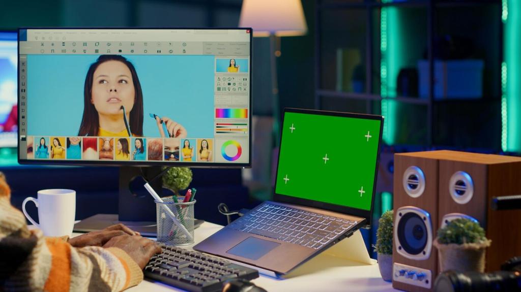
How to Enhance Colors in Photos

Chosen theme: How to Enhance Colors in Photos. Discover practical techniques, creative strategies, and subtle refinements that make your images vibrate with life while staying natural and true to your vision.

Warm vs. Cool: Reading the Scene’s Temperature

Train your eye to notice whether a scene leans warm or cool and why that matters. Warm evening light flatters skin and earth tones, while cool shade enriches blues and greens. Share a recent photo where temperature guided your choices, and invite feedback from fellow readers.

Complementary Contrast for Instant Pop

Use opposite colors on the wheel—like blue and orange or purple and yellow—to create tension that instantly elevates an image. A bright scarf against a teal wall tells a visual story. Comment with your favorite complementary pairing and how it changed your composition.

Capture Color at the Source

Golden Hour and Blue Hour Strategies

Golden hour warms skin tones and saturates landscapes without sliders, while blue hour deepens blues and purples for city scenes. Try both in a single location one day apart. Post your favorite result and tell us which hour best fit your subject’s mood.

Polarizers: Sky Depth and Glare Control

A circular polarizer cuts glare from water and foliage, revealing deeper color and truer texture. It also intensifies skies without harsh editing. If you’ve never tested one, share a before-and-after this week and tag your experiment so others can learn from your comparison.

Foregrounds and Backgrounds That Support Color

Choose backgrounds that either complement or gently contrast your subject’s colors. A cluttered background splits attention and weakens saturation perception. Challenge yourself to simplify the frame in-camera today and comment with one change that made your colors sing.
Auto WB can drift between frames, shifting skin tones and greens unpredictably. A custom Kelvin or gray card locks consistency, making edits faster and more accurate. Share your Kelvin go-to for indoor shoots and ask others for their favorite starting points.

Local Adjustments: Masks, Brushes, and Range Tools

Color Range Masks for Surgical Control

Select a narrow color slice—like a sunset’s magenta—and increase vibrance or shift hue without touching the sky’s blues. This preserves credibility. Encourage readers to share a masked detail they enhanced, explaining their threshold settings for better replication.

Brushes for Micro-Saturation and Texture

Use a soft brush to add tiny doses of saturation, clarity, or dehaze only where texture benefits—such as petals, fabrics, or weathered wood. Ask your audience where they place micro-contrast to avoid plastic-looking surfaces and gather practical tips.

Gradient Masks to Guide Color Flow

A linear gradient can deepen foreground greens while a reverse gradient cools the sky, creating a pleasing top-to-bottom color journey. Share a landscape where gradient direction changed the mood, and invite critiques on transition smoothness and feathering.

Mobile Editing: Color on the Go

Vibrance-First Workflow in Popular Apps

Start with vibrance, then adjust white balance and HSL selectively to avoid candy colors. Most mobile apps now include masking—use it sparingly. Post your favorite app and a quick step-by-step that keeps skin natural while making skies feel immersive.

Profiles, LUTs, and Presets with Intention

Presets can set a mood, but they are starting points. Reduce intensity, correct white balance, and restore neutral references. Invite readers to share a preset they love and how they tweak it for consistent color across different lighting situations.

Managing Compression and Color Banding

Export settings affect gradients and saturation smoothness. Use higher bitrate or HEIF/RAW where possible, and avoid over-editing shadows. Share your safest export for social platforms and how you prevent colors from clipping after compression.

Output Matters: Color Management and Printing

A calibrated monitor ensures skin tones and foliage colors match reality. Uncalibrated screens can trick you into over-saturating. Ask the community which calibration tools they trust and how often they recalibrate for consistent color across projects.

Output Matters: Color Management and Printing

Work in a wide gamut like ProPhoto or Adobe RGB for flexibility, then convert to sRGB for web to avoid dull previews. Explain your typical export pipeline and invite others to share pitfalls they encountered when colors shifted online.
Topicsideas
Privacy Overview

This website uses cookies so that we can provide you with the best user experience possible. Cookie information is stored in your browser and performs functions such as recognising you when you return to our website and helping our team to understand which sections of the website you find most interesting and useful.